Customize the toolbar
6 min
Note This content does apply to Commerce Connect versions 14+.
The Toolbar is a set of buttons, menus, and text with structure and action commands defined in XML. The following top menu examples show how to modify toolbar items.
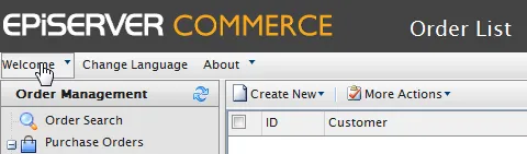
commgrcustomizetoolbar.png
Add a toolbar item
Add a new item to the Welcome menu on top of the page by creating the TopMenu.xml file in the ~/Apps/(ModuleName)/Config/View folder.
<?xml version="1.0" encoding="utf-8" ?>
    <View xmlns="http://schemas.mediachase.com/ecf/view">
      <ListViewUI>
        <Toolbar>
          <Menu id="CreateMenu" text="\{SharedStrings:Welcome\}">
             <add>
               <Button id="MyTestButton"
                       text="TestButton"
                       imageUrl="~/Apps/Shell/styles/Images/Shell/exit.gif"
                       commandName="TestCommand">
               </Button>
             </add>
          </Menu>
        </Toolbar>
        <Commands>
          <add>
            <Command id=" TestCommand">
              <CommandType>ClientAction</CommandType>
              <ClientScript>alert('test command');</ClientScript>
            </Command>
          </add>
        </Commands>
      </ListViewUI>
    </View>
Modify a toolbar item
The following example shows how to change the Sign Out text in the same menu.
<?xml version="1.0" encoding="utf-8" ?>

    <View xmlns="http://schemas.mediachase.com/ecf/view">
      <ListViewUI>
        <Toolbar>
          <Menu id="CreateMenu" text="{SharedStrings:Welcome}">
            <Button id="SignOutBtn"
                    text="{ShellStrings:Sign_Out}"
                    imageUrl="~/Apps/Shell/styles/Images/Shell/exit.gif"
                    commandName="ECF_Top_SignOut">
              <setAttributes text="New SignOut Text"></setAttributes>
            </Button>
          </Menu>
        </Toolbar>
      </ListViewUI>
    </View>
Remove a toolbar item
The following example shows how to remove the Sign Out button from the menu.
<?xml version="1.0" encoding="utf-8" ?>
    <View xmlns="http://schemas.mediachase.com/ecf/view">
      <ListViewUI>
        <Toolbar>
          <Menu id="CreateMenu" text="{SharedStrings:Welcome}">
            <remove nodeId="SignOutBtn" />
          </Menu>
        </Toolbar>
      </ListViewUI>
    </View>
XML description
You can add the following elements to the toolbar:
- Text
- Splitter. See ItemSplitter below.
- Button
- Menu
- SplitButton
Note If the XML contains an unsupported element, the NotSupportedException exception is thrown.
Toolbar attributes
- id – Unique identifier within XML.
- text – Element label (button, menu and so on).
- imageUrl – Element icon (only used for Menu, SplitButton, Button).
- cssClass – Element stylesheet css class.
- align – Element location (can be Left, Right). The default value is Left.
- handler – Client handler which is called when element is clicked; the client method name must be specified; the element object is passed as a parameter to the client method.
- commandName – command; enableHandler of that command determines whether an element is visible.
- itemSplitter – Added to a Splitter element, can have the following values:
- None (default) – Separator is not added.
- Left – Separator is added to the left of the element.
- Right – Separator is added to the right of the element.
- Both – Separator is added on both sides of the element.
- tooltip – Define element tooltip.
- permissions – Text parameter passed to the enableHandler for the command.