Parameters overview
Parameters make your Analytics explorations and modeling artifacts more flexible and reusable. You can reference parameters in any exploration, such as Funnels, Paths, Event Segmentation, Retention, Impact, Universal Exploration, and Experiment Scorecard, or inside modeling artifacts, including derived columns, cohorts, and metrics.
When you use visualizations that reference modeling artifacts, parameters flow through both the visualization and the underlying logic. Parameters are a powerful way to fine-tune analyses without modifying the underlying queries or artifacts.
You can also connect parameters to dashboards through parameter tiles to control values directly from the dashboard and apply consistent filtering across multiple tiles.
Parameters are available in the following explorations:
and in the following modeling artifacts:
Parameter types
There are four different types of parameters that you can create in Analytics.
Column values
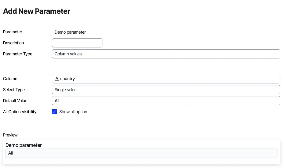
This parameter type dynamically pulls a list of available values directly from a specific event property or user attribute column within Optimizely. It ensures that your parameter options are always up-to-date and reflect the actual data being collected, making your dashboards flexible and data-driven. Configure the following fields:
- Parameter – Provide a display name for your parameter (e.g., "Device type filter"). This name will appear on your dashboard for users to interact with.
- Description – Provide a brief explanation of what the parameter does, helping users understand its function.
- Parameter Type – Select Column values from the dropdown to indicate that this parameter will draw its options from a data column.
- Column – Select the specific event property or user attribute column from which to draw the values (for example, device_type, country, experiment_id). Analytics automatically populates the parameter's options with all unique values found in this column.
- Select Type – Specify whether to allow single-selection or multiple-selection. This field displays after you select the column.
- Default Value – Select the value to pre-select when the dashboard initially loads. This sets the default view for your audience.
- All Option Visibility – Check the Show all option option to determine if an "All" option should be available. If checked, users can select "All" to view data without any specific filter applied from this parameter.
For example, you can create a parameter based on the country attribute. This lets you select a specific country (for example, United States, Germany, Japan) to filter all visualizations on the dashboard to show data only for users from that selected country.
Custom values
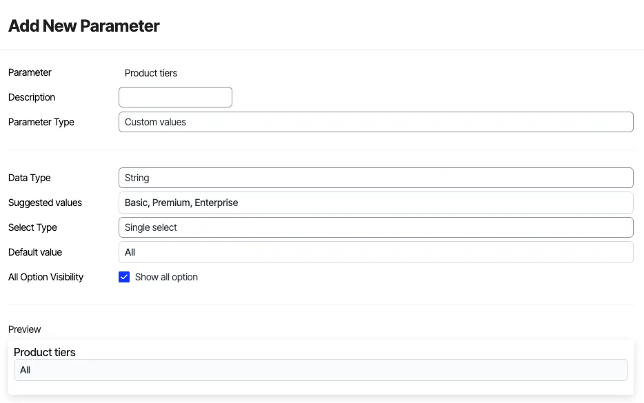
Unlike column values, these parameters are manually defined lists of values that you specify. This provides complete control over the available options, which might not directly correspond to a single data column. It is ideal for scenarios where you need a fixed set of options, perhaps for internal categorization or specific reporting needs that do not directly map to an existing column. Configure the following fields:
- Parameter – Provide a display name for your parameter (for example, Marketing Channel).
- Description – Provide a brief explanation of what the parameter does.
- Parameter Type – Select Custom values to define your own list of options.
- Data Type – Specify the type of data for your custom values (for example, String, Number, Boolean). This ensures data consistency.
- Suggested values – Enter the list of values that will be available for selection in the parameter's dropdown (for example, Email, Social, Paid Search).
- Select Type – Specify whether to allow single-selection or multiple-selection. This field displays after you enter the suggested values.
- Default value – Select the value to pre-select when the dashboard initially loads.
- All Option Visibility – Check the Show all option option to determine if an "All" option should be available, allowing users to view data across all custom values.
For example, you can define a custom list of "Product Tiers" such as "Basic," "Premium," and "Enterprise." This allows for consistent reporting across these predefined categories, even if your raw data tracks these with more granular event properties or does not have a single "Product Tier" column.
Time range
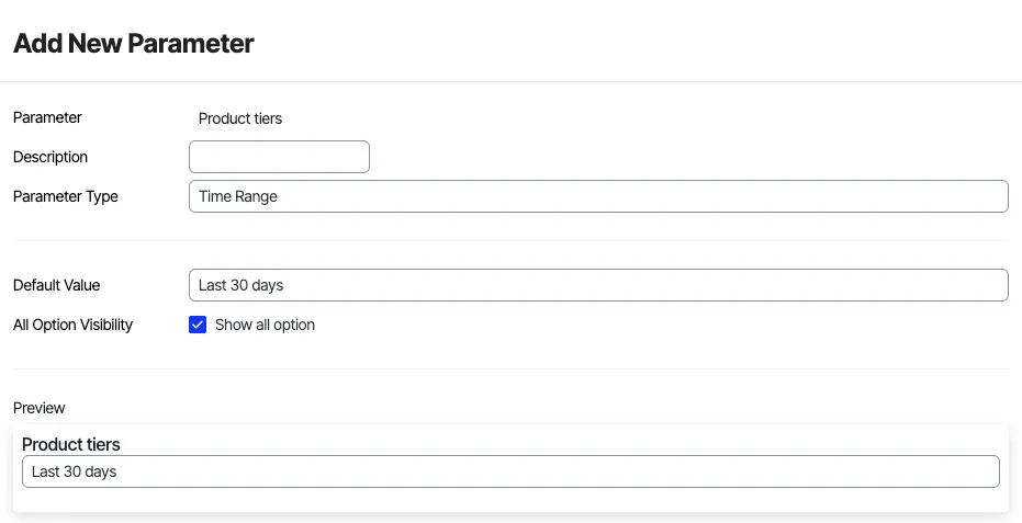
This parameter defines the specific period over which your data visualizations and explorations will aggregate and display information. It's crucial for consistent historical analysis and performance comparisons, enabling users to quickly switch between different time frames without manually adjusting each visualization. Configure the following fields:
- Parameter – Provide a display name for your parameter (for example, Reporting Period).
- Description – Provide a brief explanation of what the parameter does.
- Parameter Type – Select Time Range to configure a parameter for date-based filtering. Default Value: Select the default time range you want to see when the dashboard loads (e.g., "Last 30 days", "Last 7 days", "This Quarter").
- All Option Visibility – Check the Show all option box to determine if an "All" option should be available. While less common for time ranges, it lets you view all available historical data.
For example, a time range parameter set to Last 30 days displays the total conversions, unique visitors, and average session duration for the past month across all dashboard tiles. Changing it to Last Quarter updates all visualizations to reflect data from the previous three months, facilitating easy period-over-period comparisons.
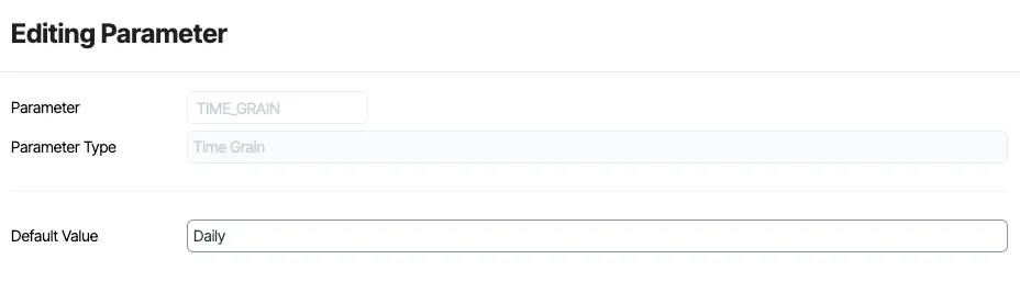
Time grain
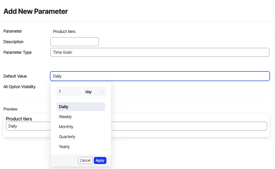
This parameter determines the level of aggregation for time-series data, influencing how trends are visualized over the selected time range. It dictates whether your data points are grouped by hour, day, week, or month. Changing the time grain can reveal different patterns – a daily view might show short-term fluctuations, while a monthly view highlights broader trends. Configure the following fields:
- Parameter – Provide a display name for your parameter (for example, Data granularity).
- Description – Provide a brief explanation of what the parameter does.
- Parameter Type – Select Time Grain to configure a parameter for time aggregation.
- Default Value – Select the default unit of aggregation (e.g., "Daily", "Weekly", "Monthly", "Hourly").
- All Option Visibility – Check the Show all option box to determine if an "All" option should be available. This is generally not applicable for time grain as a specific unit of aggregation is always required.
For example, if you are viewing a Last 7 Days time range, setting the time grain to Daily shows a data point for each day. If you change the time grain to Hourly, the same 7-day period displays 24 data points for each day, providing a much more detailed view of intra-day fluctuations. Conversely, for a Last 12 Months time range, a Monthly time grain displays 12 data points, while a Weekly grain displays approximately 52 data points, offering a more granular trend.
Note
You can create time range and time grain parameters only as dashboard parameter tiles.
Time grain controls how Analytics groups your data over time. Choosing the right grain helps you highlight short-term volatility, long-term trends, or recurring patterns.
For example:
- Hourly surfaces intra‑day changes.
- Daily highlights day‑to‑day fluctuations.
- Weekly smooths out short-term noise.
- Monthly surfaces broader seasonal patterns.
Create parameters in Analytics
There are multiple ways to create parameters in Analytics.
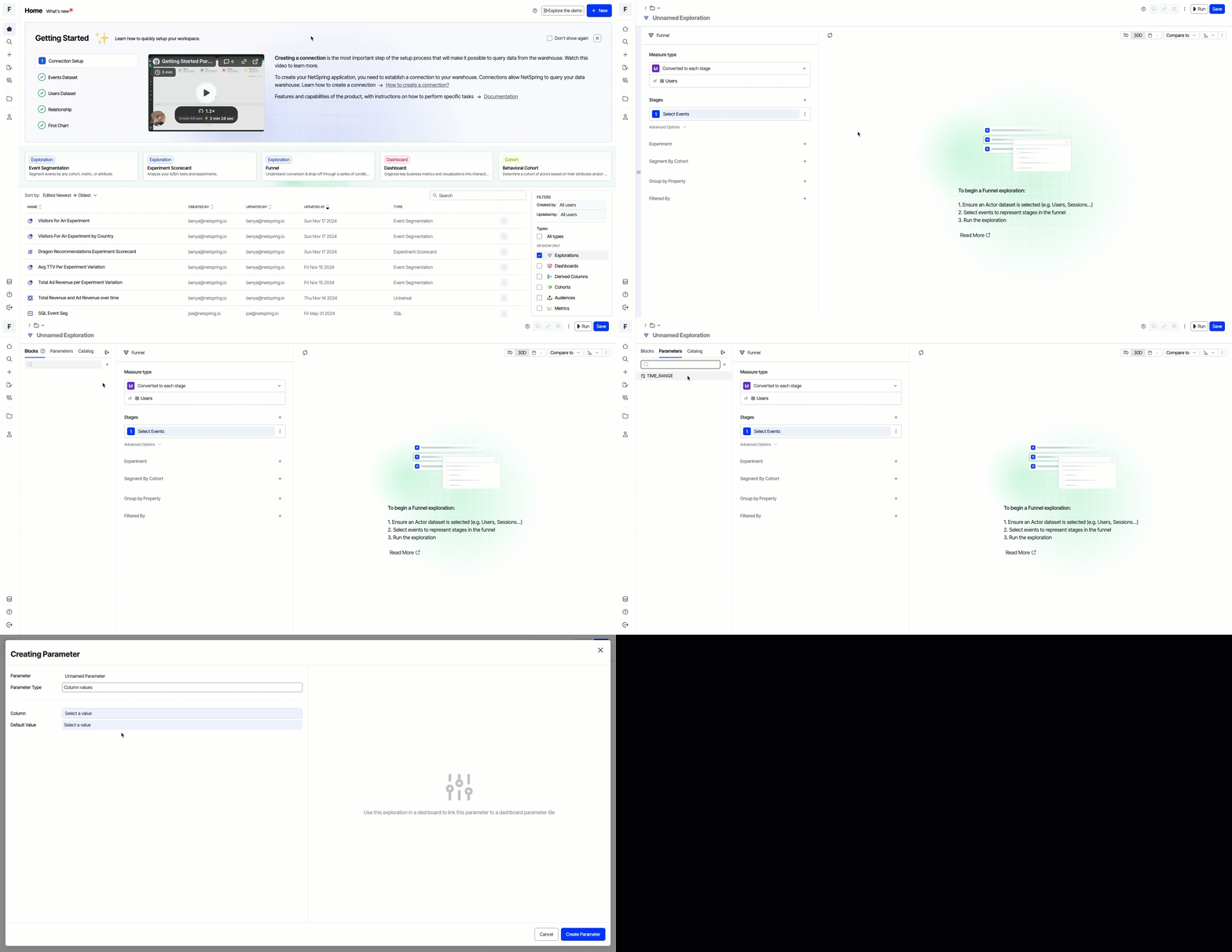
Create parameters with pull-out drawers
You can use the pull-out drawers from all the explorations and model artifacts.
- From an exploration or model artifact, click expand shelf.
- Select the Parameters tab.
- Click Add.
- Enter the parameter information and click Create Parameter.
Create parameters with Filters section
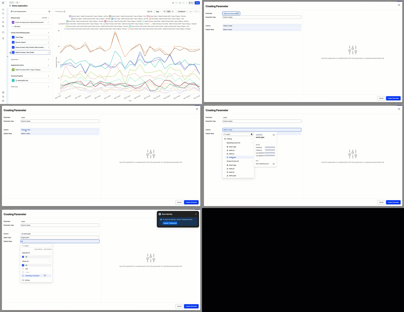
You can create inline parameters using the Filters section in any exploration.
- Go to any exploration, dashboard, or model artifact and go to the Filters section.
- Select the Parameters tab, type in the name of the parameter you want to add in the search bar, and press Enter.
- Analytics creates a parameter in the background and automatically maps it to a related column. You can see this within the pull-out drawer where you can configure your parameters.
Query filtering with parameters
Query filtering using parameters is one of the most common use cases. To simplify this, Analytics has a first-class UX to perform query filtering within dashboards. This ensures there is no confusion between query filtering and parameter tile UX.
When users define a dashboard parameter tile, Analytics suggests all the currently defined parameters across all dashboards and other parameter tiles.
While defining a new parameter in the context of a visualization tile, Analytics prompts users to specify a default value for that parameter so Analytics can render the visualization immediately without further input from the user.