Page column image sizing in Classic CMS
Important
Classic CMS reached end-of-life in January 2025 and is no longer receiving feature updates or bug fixes. You should [migrate to Spire CMS](../../End user docs/spire-cms/get-started-with-spire-cms/migrate-from-classic-cms-to-spire-cms.mdx).
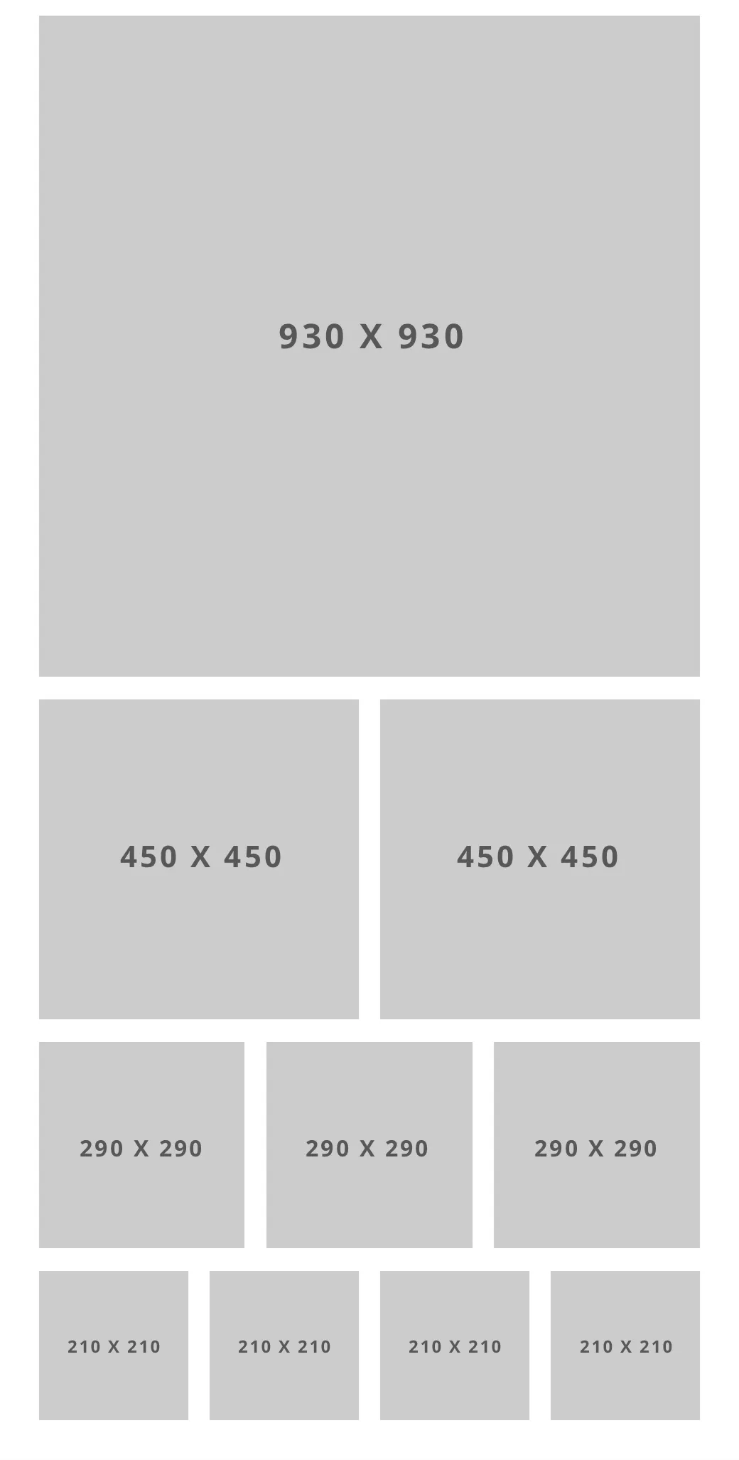
For large screens (desktops), here are the recommended max pixel widths for images to fill their column:
For mobile screens, columns stack so that everything becomes 1 column. Here is how the different image sizes display on small screens:
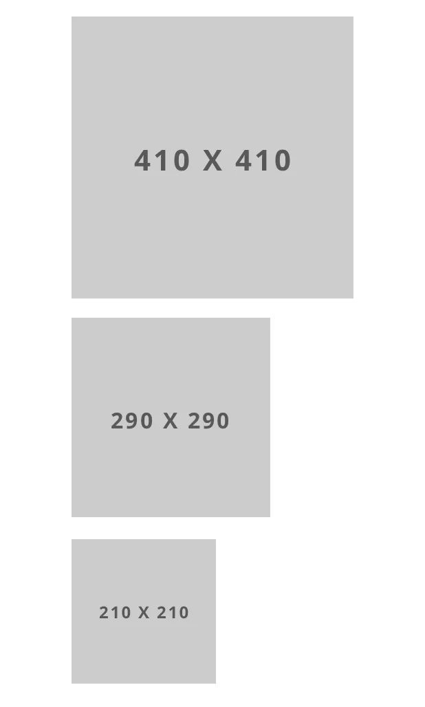
With mobile screens in mind, images that are less than 410 pixels wide (height does not matter) will not fill their container on many mobile screens (that is columns have a max width of 410 pixels on smaller screens). This means for 3 and 4 column layouts, images at least 410 pixels in width will display best for all screen sizes, and fill their columns.